
Creating an app with Svelte

Welcome to part 2 of my Svelte journey! If you haven’t seen part 1 you can read that here:
[embed]https://sredmond.medium.com/why-you-should-consider-using-svelte-b1268140e481[/embed]
Part 1 includes a brief history of Svelte as well as my initial feedback of what I think of Svelte after going through the tutorials and seeing some of the capabilities.
So I didn’t want to just go through the tutorial and call it a day. I really wanted to give Svelte a proper spin. So I decided I would make a basic to-do list application. You can find the code for it on GitHub here:
[embed]https://sredmond.medium.com/why-you-should-consider-using-svelte-b1268140e481[/embed]
So right off the bat, I discovered something that pretty much retracts one of my negatives. That thing is Svelte Kit, which basically fulfills the not having to write boilerplate configs and the such myself which is really all I wanted especially as someone new to using Svelte.
[embed]https://sredmond.medium.com/why-you-should-consider-using-svelte-b1268140e481[/embed]
Using SvelteKit was actually really as easy as the page says I just typed in npm init svelte@next svelte-todo and BAM almost instantly I had a fully operational bare-bones project. One reason it’s so fast is that it doesn’t immediately install the npm packages you have to do that yourself. When you do install your npm packages you may get a warning if you’re using an older version of Node lesser than 12.20 I believe you won’t be able to install the packages. It will give you a warning and tell you what Node versions it needs. If you’re a new developer and you’re just installing the latest LTS release no worries, but I thought I’d point that out.
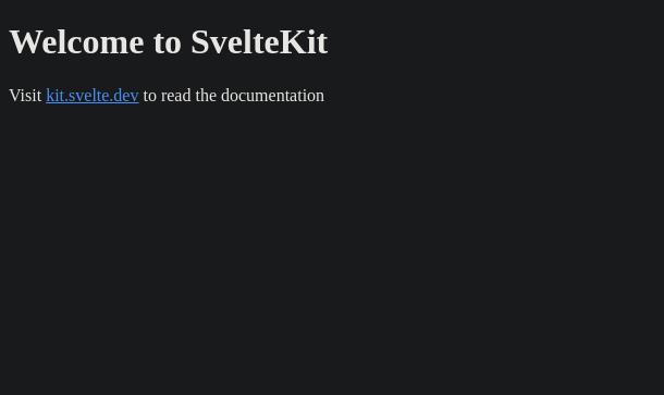
Once you have everything installed you can run npm run dev and then open your browser to localhost:3000 and (if you have the Dark Reader extension that makes all websites dark mode as I do) you’ll be greeted with a page that looks like this.
The Mockup
Now that we’ve gotten that introduction out of the way, what am I actually going to build here? I’m not much of a UX designer but I can use Figma to some degree. I envisioned something that looks kind of like this:
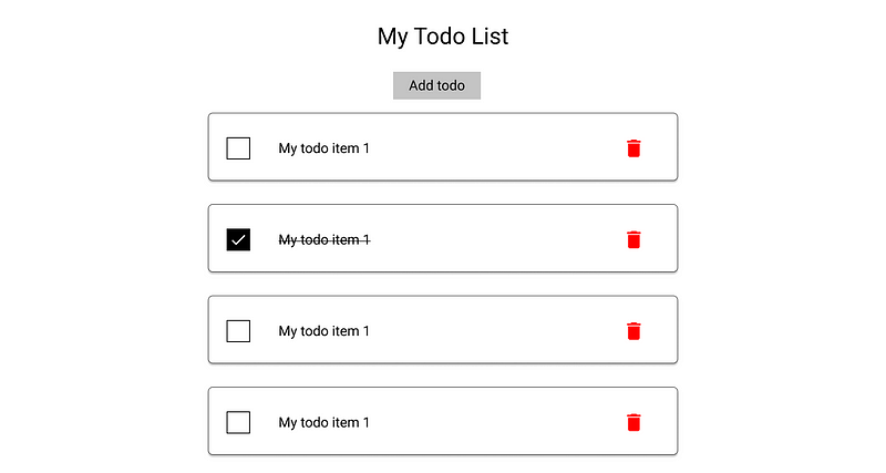
There isn’t a whole lot of pizazz in this initial mock-up because, more than anything, I just wanted to get an idea of what it looks like as opposed to a finished product. This is a really basic and bare to-do list. Kind of a material theme because I like the look of it with some basic functionality. Speaking of functionality what, exactly, does it do? Here are the requirements:
- Add todo items
- Remove todo items
- Check off todos
If this list seems small, well that’s intentional. We’re starting off with the most basic requirements and we’ll basically build up from there. Now that we have a really basic idea of what it looks like let’s plan out our components. Also, I don’t want to hear about how the styling isn’t very exciting, I know it isn’t if you’re a CSS master and want to add your own exciting flashy styling more power to you. This is just a basic implementation to test out how Svelte works in a more real-world environment.
The Components
We’re probably going to want a button component and a checkbox component to start off with. We want these two components because we want to be able to style these components independently and control their functionality while also ensuring that we can re-use them throughout our whole application.
We’re going to want a to-do item component, but we’re going to want to know what makes up a to-do item. These are the things I thought of that would go into the todo item:
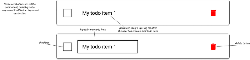
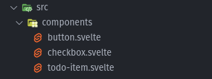
Now that we have a better idea of the components we’ll need let’s create a few of them. First, we’re going to create a components directory under src and then we’re going to fill it with a few components:
We want our own custom button that we will impose our own styling on. We will also design the button so that it will handle text-based buttons as well as image-based buttons like the delete button. We will want our own checkbox that we will similarly impose our own styling on as well. The todo-item component is a bit different as it pulls the checkbox and button components into it.
The Button
We want to have our own custom button so we created a button component. So here’s the code for the button:
<script>
  /**
   * This will default to false but if true will remove most of the styling
   * and display plainly whatever is in the button
   */
  export let img = false;
</script>

<!-- Blank method for on:click will pass that event to whatever component uses this one  -->
<button on:click class={img ? "img-button" : "text-button"}>
  <!-- slot will cause button text to just be injected here -->
  <slot />
</button>
We have a minimal script in this because it doesn’t really DO much. We can basically ask if this button is supposed to represent an image or some text. If we’re supposed to represent an image we can switch between the image. Here is an example:
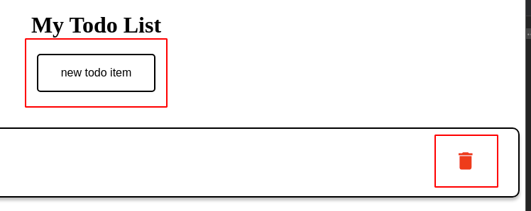
We can see that the “new todo item” button and the “delete” button are very different but are the same component. Svelte makes it easy to use a ternary operator to swap classes based on a flag which is nice. This is also a very slim component, but it leaves us the possibility to do a lot.
In the button you can also see we have several things going on:
<button on:click class={img ? "img-button" : "text-button"}>
  <!-- slot will cause button text to just be injected here -->
  <slot />
</button>
First, the empty on:click forwards the on:click even to the parent element. This gives us the ability to respond to that event from a parent element without having to write any code. In my opinion, it’s a really nice way to forward events.
The second thing, we have an element called “slot”. This is basically a placeholder for anything we want to put into the button.
<Button on:click={newTodo}>new todo item</Button>
So the text “new todo item” will replace the “slot” tag. This is also a really nice feature to keep your components simple and clean.
The Checkbox
I’m not going to include the styling here because there’s a lot of it and I wanted to look at the component. If you’re interested in the styling, go check out the code on GitHub.
<script>
    export let checked;
</script>
<label class="container">
<slot />
<!-- If we want the checkbox to have a lavel -->
<input type="checkbox" bind:checked on:change />
<span class="checkmark" />
</label>
This is also a really simple component. It forwards the on:change event so we can respond to it from a higher level. Then we also bind the checked property to the input. We export the checked property because, essentially, we’re going to pass checked into the component and bind the parent’s property to the checkbox so we can tell when it is checked and not checked. There’s probably no reason to do BOTH but I wanted to see how well it worked.
The Todo Item
I’m also going to leave the styling out of this one for the same reason as above.
<script>
import Checkbox from "./checkbox.svelte";
import Button from "./button.svelte";
import { items } from "../state";
export let content;
export let id;
export let isNew = false;
let checked = false;
function deleteSelf() {
  $items = $items.filter((x) => x.id !== id);
}
</script>
<div class="container">
  <div class="todo-item">
    {#if isNew}
      <input type="text" placeholder="type your todo here!" on:keydown/>
    {:else}
      <Checkbox bind:checked />
      <p class={checked ? "completed" : ""}>{content}</p>
    {/if}
  </div>
  <Button img={true} on:click={deleteSelf}>
    <img src="/delete.svg" alt="delete button" width="20" />
  </Button>
</div>
This is more of a compound component since it’s made up of 2 of our other components with some other stuff included. So This gives us a container for our todo item as well as toggling if we’re creating a new todo, by giving us the ability to type into a field, or displaying some existing text.
We also have an SVG image of a trash icon for our delete button that we can see makes use of the forwarded on:click event and the “img” flag.
You’ll also notice that the delete function occurs inside the component when we want to take it out of the array of items (we’ll talk about state in a bit). I understand this can be somewhat controversial but this is just the way it seemed most natural to do for me.
The Main Page
<script>
import TodoItem from "../components/todo-item.svelte";
import Button from "../components/button.svelte";
import { items } from "../state";
items.set([]);
let isNew = false;
function newTodo() {
  isNew = true;
}
function onKeydown(event) {
 if (event.code.toLowerCase() === "enter") {
   const value = event.srcElement.value;
   $items = [{ id: $items.length, content: value }, ...$items];
   isNew = false;
 }
}
</script>
<h1>My Todo List</h1>
<div class="button-container">
  <Button on:click={newTodo}>new todo item</Button>
</div>
{#if isNew}
  <TodoItem content="" id="0" isNew={true} on:keydown={onKeydown} />
{/if}
{#each $items as todo (todo.id)}
  <TodoItem content={todo.content} id={todo.id} />
{/each}
This is the main page where everything gets put together. One thing I didn’t really get to have a closer look at was Svelte’s routing, which I’ll likely cover in a later post.
So at this level is where we add new to-do items. We have a designated spot where, if we have a new item, we will show the todo with the “isNew” flag set to true. Then we can listen for the on:keydown event and grab the value of the element when the key code is “Enter”. Then we can set state by adding a new item to the state array as well as spreading the rest of the items into it. Remember, Svelte requires us to set a value in order to trigger its reactivity.
State
Before we go any further let’s talk about state.
import { writable } from "svelte/store";
/**
* An array of {id: number, content: string, complete: true, completedOn: number}
*/
export const items = writable([]);
We have a file that contains our state which is basically a Svelte “writable”. Basically, Svelte gives us some basic ways to manage app state so we don’t have to use things like Redux or whatever other state management solution there is. Svelte’s state management is also really easy to work with.
items.set([]);
On the main page, we import the items from our state file. Then we can run operations on it like the “set” function. So when our application starts and we hit the main page we can set our state to be an empty array.
$items = [{ id: $items.length, content: value }, ...$items];
We can also manipulate “$items” as though it were just a plain and simple array. This makes the state easy to work with and we can use it from any file we want to. For example the deleteSelf function in the todo item. I’m also giving each item an id of the array length (which has a boatload of issues and is generally a bad idea, but it was a quick and dirty solution).
function deleteSelf() {
  $items = $items.filter((x) => x.id !== id);
}
Now, I know it’s probably an anti-pattern to have a component update application state. This is what felt natural and I also wanted to see how well it worked. Turns out, it works pretty well! Remember, we can’t just remove an item from the array, we have to assign the array to a value. The first thing I thought of was that I could filter the item out by the id and reassign the array. It works pretty well, but I suspect that if we had a large number of items it would start to become a less ideal solution.
Overall Experience
Overall, I really enjoyed Svelte! SvelteKit made getting started really simple and straightforward. It gave me all the boilerplate stuff I needed to get an app up and running. Svelte itself was easier to use than I thought. It was very much similar to plain JavaScript but with a lot of really nice extras thrown in.
Running the development bundle locally was also really nice because it has a really fast and efficient hot-reload that doesn’t reset your application state. This is a really handy feature especially if you’re working on a feature that is dependant on the application state. Not having that reset makes development much easier.
Overall, I would give Svelte a solid 9/10 for ease of use, learning curve, speed, and developer experience! If you’re curious about Svelte feel free to fork my repo and solve some of the issues I talked about in this post!
If you’ve enjoyed this article I’d love for you to join my mailing list where I send out additional tips & tricks!
If you found this article helpful, interesting, or entertaining buy me a coffee to help me continue to put out content!