Using Web Components in Angular

As the picture indicates, this will be about Angular Elements and Web Components. There are a lot of buzzwords that are always floating around; such is the current state of software development today. One of those buzzwords is micro front-end. What does that mean? The fundamental idea of micro front-ends is that you can incrementally release chunks of your front-end. You would have various teams responsible for various features, and then you can release them when they’re ready. The advent of Web Components has really started to bring this idea to life. Using Web Components, you can create individual components and start to put those together in whatever way that makes sense for your application. Let’s dive into how this works with Angular. Throughout the article, I will have a lot of screenshots of code; you can find the complete code on GitHub, which I’ll include a link at the end of the article.
Why Angular?
Anyone familiar with me at this point knows I’m a fan of Angular. However, there is another reason I’m choosing Angular Elements for this. Angular Elements is one of the most mature Web Components libraries out there. It’s easy to work with and works the exact same way as any other Angular project, with a few minor differences that we’ll cover. Is it the only one out there? Absolutely not. You can build Web Components with just about anything from plain JavaScript, React, Vue, etc. If you’re not a fan of Angular and want to check something else out, I recommend StencilJS. The Ionic team makes StencilJS, and it’s something I’m looking forward to covering in a later article. With StencilJS, you can use plain JavaScript or the library/framework of your choice, including Angular.
Starting the project
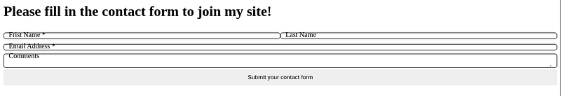
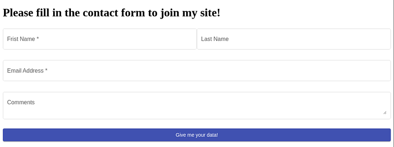
One of the most challenging things to do as a software engineer is to name your project. Once that’s taken care of, the next most difficult thing is starting that project. Fortunately, we’re just working with an example project, so these things aren’t too tricky for us. We’re going to be building an Angular project that will be a single component. For this example, we’ll do a simple contact form. This form will have form fields to enter your name, email address, and some comments. The form will have its own validation, and it will output data for the consumer of the component can get the data.
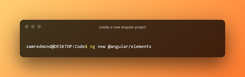
Getting started with Web Components in Angular is the same as starting any other Angular project.
We don’t need any routing in this project, so you can leave everything as default. The one thing I usually change during the app initialization is making the style sheet processor SCSS instead of CSS, but that’s really up to you. Once your Angular project has been created, we will open it in VS Code (or whatever editor you prefer).
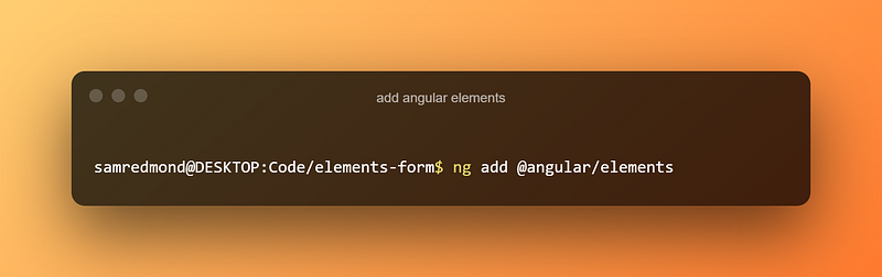
The next thing we’re going to do is add Angular Elements.
I should note that Angular Elements doesn’t use Schematics at the time of writing this, but it should in the future and Angular schematics are nice to use anyway, so I usually do it this way. This is going to install Angular Elements in our project. When writing this, the schematics could do a little more for us since there’s still some manual work to do to get our project running properly. We’ll get into the manual config in the next section.
Configuring Elements
Before we can really get into writing the code, there is some manual work we need to do (I may have mentioned that). In this section, we’re going to completely configure our application to give us a web component that we can export anywhere!
Configuring Budgets
The first thing we’re going to need to do is to update our budgets. Before we do that, what are budgets, and where do we find them? First off, when we create an Angular project, we get a file called angular.json. This file will contain all the config we need to build and serve our Angular project. If you haven’t really looked at it before, go ahead and give it a look. While you’re looking through the file, you will notice a section called budgets, and it should look something like this.
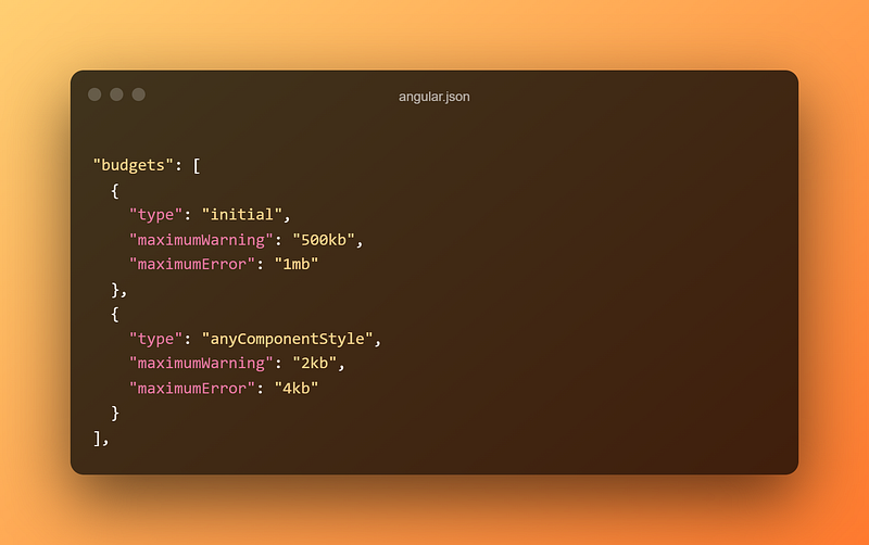
As you build your application, it will grow larger in size. These budgets allow you to contain the sizes of your components and build size. If your budget is exceeded, then your project won’t build. These essentially help ensure that one file doesn’t grow too cumbersome and the project doesn’t balloon in size. However, for our purposes, this configuration won’t do. When we build Angular elements, we basically want one single file to server as opposed to a bunch of small files like a regular Angular project. These budgets will get in the way of that build, so we have to modify them. Let’s have a look at what we need to change.
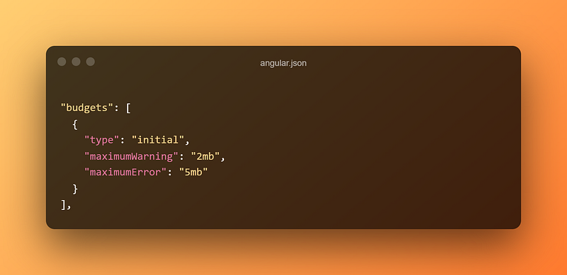
We’ve completely removed the anyComponentStyle since we’re basically outputting one big component, the styles will always be bigger, so it’s easier to just remove it. We want to set the max warning to 2 megabytes and the max error to 5 megabytes for the initial budget. We don’t want to remove that completely since we don’t want our project to completely balloon, but we will need to set it considerably higher since we’re outputting single components.
At this point, you may be thinking to yourself, “jeez, 5mb for a front-end project that seems a bit steep!”. You’d be partially correct. However, you have to think about a few things
- That max budget will probably never get hit; that’s just your warning and error threshold
- The bundle you get has everything Angular has to offer. No holds barred!
- You can defer the script, and it won’t have any noticeable impact on your application’s performance
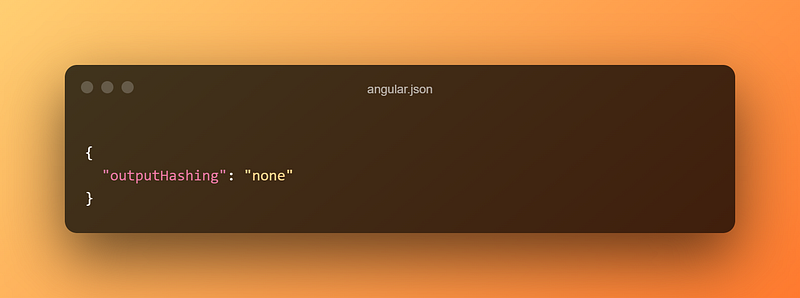
Removing Output Hashing
We’re going to stay in the same file, angular.json and we’re going to turn off output hashing. Before we do that, let’s talk about what that is for a second. Output hashing is a pretty sweet feature of Angular. If you search for outputHashing in your angular.json file you’ll find that it is currently set to all. What that does is when you’re building your project, it will create a hash of the contents of your file and then append that to the file name. So instead of always getting something like, you’d get main.123abc.js. If any of the contents of the file change, so will the hash. This is a nice feature of Angular because when you change something in your project, the hash will change, and the browser will be forced to reload the file. That way, your users aren’t waiting for their cache to refresh to get your changes.
Although this is a great feature for a regular project, we will be turning this off for Angular elements. You’ll see why a bit later on. All we have to do is change the value of output hashing.
Now that we aren’t putting hashes on all our files, we’ll move on to the next section.
Configuring AppModule
Now that our config is all set, we can configure the code a bit. We’re going to be configuring the App Module. This is what it should look like.
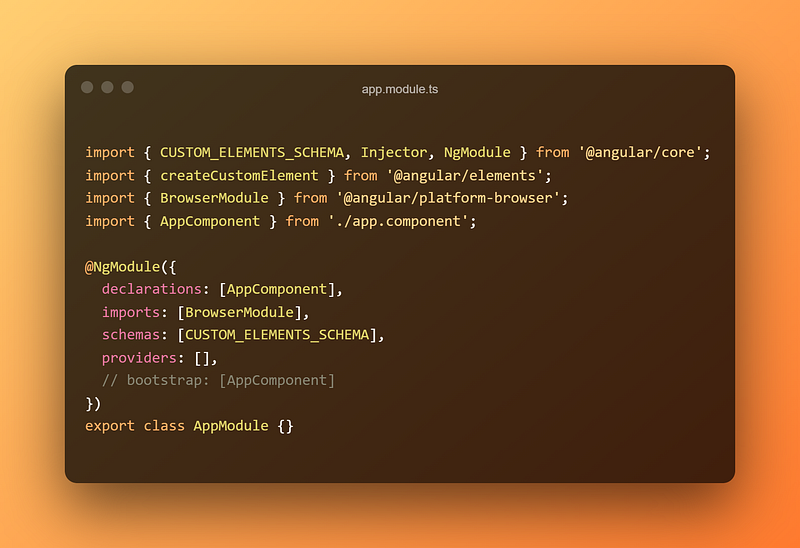
The first thing we are going to do is remove the bootstrap section under @NgModule . We don’t want the main component to be bootstrapped like a regular app. The other thing we’re going to do is add CUSTOM_ELEMENTS_SCHEMA to the schemas array.
Then we’re going to add some code to the AppModule class.
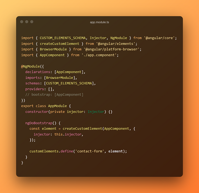
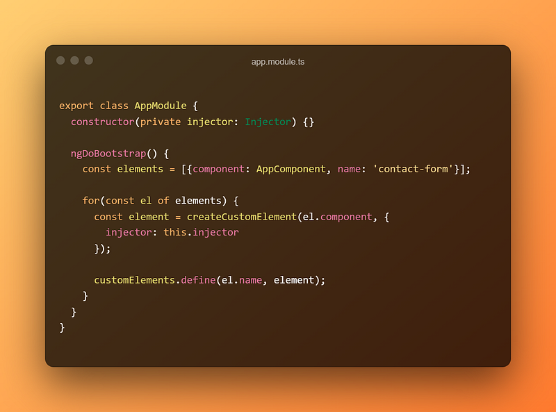
Since we turned off the normal Angular bootstrapping, we’re going to need to tell Angular how to bootstrap this component. We can do that in the ngDoBootstrap function. First, we use Dependency Injection to get an Angular injector into our module class. Then we use that to create a custom element. Lastly, we’ll give our custom element a name; in this case, it will be contact-form. This is just a simple project, but you can output as many components as you want. If you’re doing multiple components, I would use an array and iterate over those. Something like this:
You’ll see how we will use that later. We need to take one final step before we can actually start using our component as a web component.
Configuring the build step
If we run the build command right now, we’d get a bunch of files in the dist folder. In order to make our element work, we need all the JS files to be one file. There are a couple of ways we can do this. The first way is by creating a concat file that will get run when we run the build script. We need to install two dev dependencies before we can start.
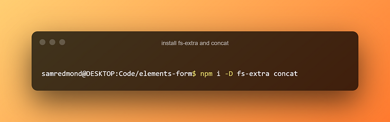
Once we have those installed, we can create a file called concat.js in the root of our project.
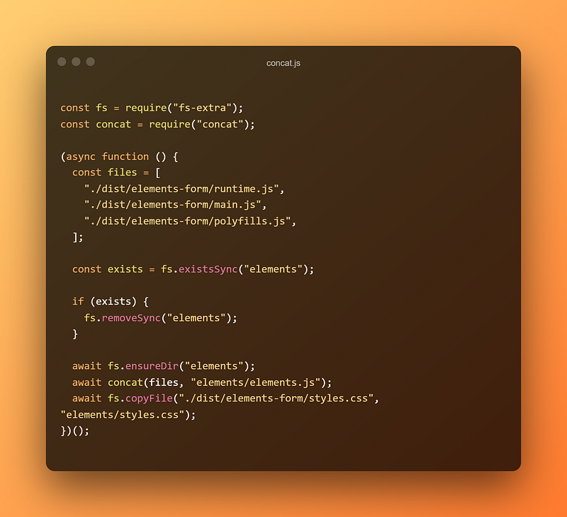
This is the reason we turned off output hashing. We need to be able to predict the file names, and we can’t do that if the file name changes every time we change something. This is going to take our runtime, main, and polyfill files and concatenate them into a single file we’ll call elements.js.
The first thing it will do is remove any existing folder called elements. This is to make sure that the build directory is clean. Then it will ensure that a blank folder called elements exists. Then it will concat our files array into the elements directory as elements.js. The order of these files is actually very important. The runtime file contains all the loaders to make our application run. This needs to go first so that it knows how to make our component run. Then we can put main.js which is just our custom code. Lastly, we will load in the polyfills file, making our application compatible with various browsers.
Once our concat script is done, we will create a new build script in package.json.
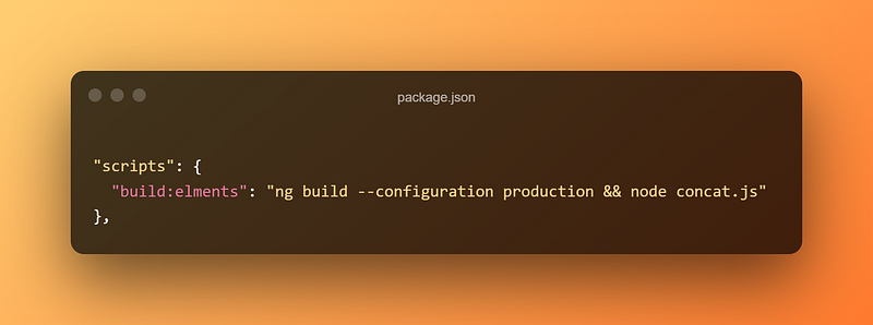
This will build the application using production config and then run our concat script. Since the elements directory is technically a build directory, we will probably want to exclude that from your source control.
Testing Your Elements
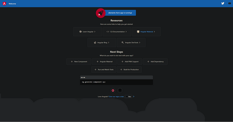
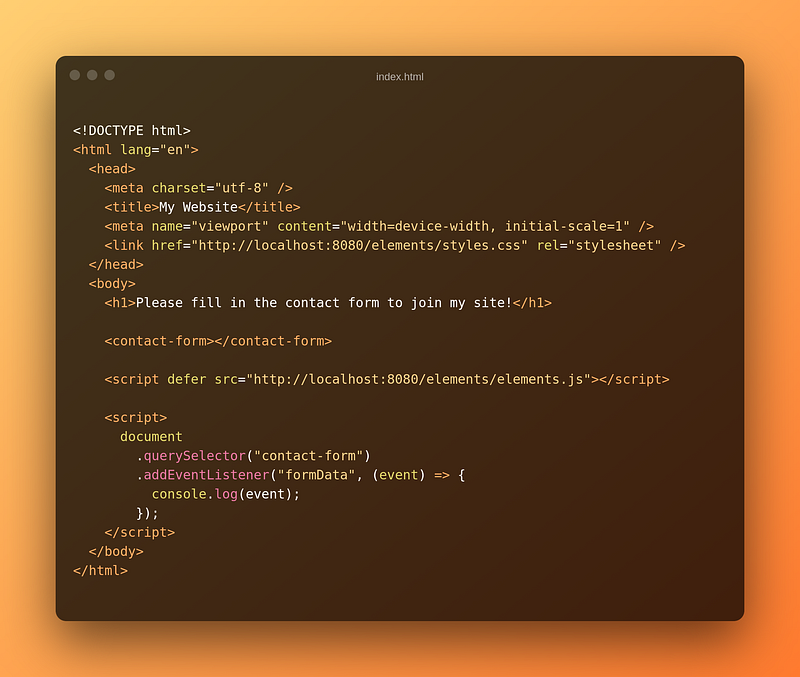
Now that we have everything configured, there is a really easy way for us to test if it works. In the index.html file we can comment out the <app-root> tag and replace it with our custom element.
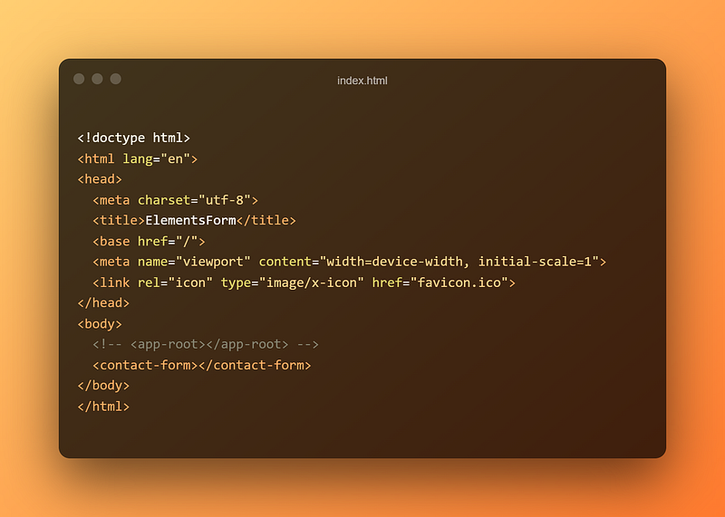
Once you do that, go ahead and start the app! If you see the following, you know it’s working!
Now that we know everything is working, let’s start working on our component!
Creating the Contact Form
To actually create the contact form, we’re going to use Angular Material. You can use whatever you want or just create your own styles for things if you’d like.
Setting up Angular Material
If you feel like using Angular Material, you can follow this section, but it’s not totally necessary. I noticed that I had a particularly difficult time getting the Material styles to appear once the widget was exported. I’ll talk about that a bit later, though.

You’ll be asked for a few config options, and you can pick whatever you want. Once that is done, we can delete everything in app.component.html and remove the title variable from app.component.ts.
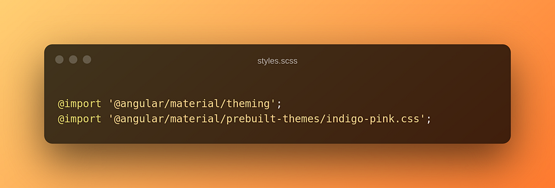
The next thing we’re going to do is add these imports to styles.scss
You can also go into Angular.json and remove the import for Angular material in the styles array.
Creating the Form
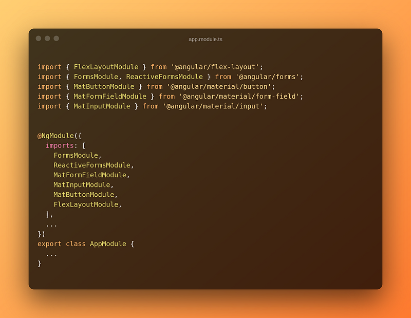
Now that we have our styles all set up, we can start creating our form. I’m also going to be using Angular Flex-Layout, which you can install using npm i @angular/flex-layout. This just makes things a little easier. Then we need to import the modules we’re going to use in the app module.
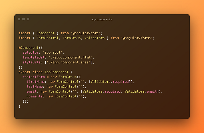
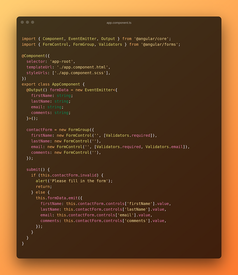
The next thing we have to do is make the form group in the app component.
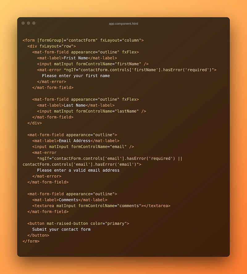
Lastly, we can create the HTML for our form to display correctly.
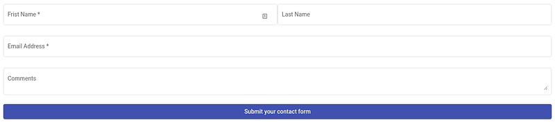
Now, if we run our app, everything should work!
Exporting Data
Now that we have a working form, we need a way to get the data from the form into the website using our component. The awesome thing about Angular Elements is that it lets us do that in the same way we would normally do in Angular.
We’re going to create an event emitter as an output and create a submit function that will call the event emitter with the data from the form.
The last thing we need to do is make sure that our submit function will be called when a user clicks the submit button.
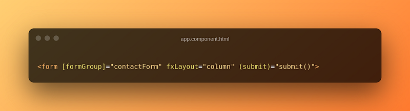
Whenever we have a form in Angular with a submit method, it will be called whenever a button is clicked inside that form. With all this done, we are ready to actually use this on any page!
Using The Exported Component
So now we have a functional component that we are able to build into a bundle that any website could use. Let’s have a look at how we actually use this in a real-life situation. To do this, I like to use http-server which you can install pretty easily using npm i -g http-server.
Then we’re going to create a new folder called test-website , and inside it, we’re just going to have a file called index.html. In that file, we’re going to put the following code.
There are a few things I want to note here. The first thing is that you should notice the imported styles and scripts. Remember when we used the import for Angular Material in our styles.scss file? The reason for that is that we need those styles to be exported into our main styles file. This will ensure that when someone uses our component in their website, the styles we want are applied. Then we are going to import our elements.js which will actually make our code work.
You should also notice that we have used <contact-form></contact-form> inside this file. That’s literally all you have to do to get the component working.
If you want to get the data out of this custom component, we need to attach an event listener to it. Remember, we’re using @Output in our component, which just creates an event emitter. So that’s what we’ve done in this example.
Now we need to build our code using the npm run build:elements script. Once we’ve done that, we can start a server in the root of our project using http-server. You don’t have to use this at all, you can simply use a local path to the elements, but this is just what I like to do.
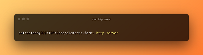
That will start a server running on port 8080. Now that we are serving our elements, we can open a new terminal and CD into the directory where our other index.html is and start another server there.
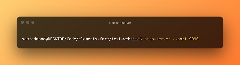
Since we are already using port 8080 to host our elements, we will tell http-server to host our website on port 9090. If you go to localhost:9090 in your browser, you’ll notice that everything works!
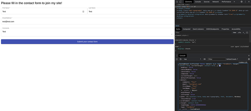
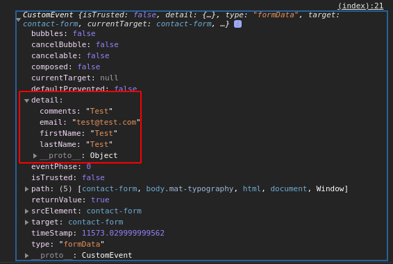
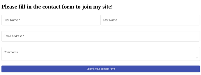
The form looks good, it has all the right Angular Material styles, and it’s in the right order that we put it in. We’re able to fill in the form, the form does validation, and when we submit the form, we get an event. If we take a closer look at that event, we can see that we get the data from the form in the detail object.
Some Final Notes
There are a couple of things I wanted to talk about before ending the article. The first one is style adoption. If you notice in the screenshot, all the styles for the form are correct, but if you look at the H1 tag, that’s not a part of the form. If you look carefully, you’ll notice that the H1 tag has the same font styling that our web component has. This means that the styles we included in the head have bled out into the rest of the website. This probably isn’t great for a production-ready application. How do we fix this? In short, we need to use the Shadow DOM (not the shadow realm).
We need to edit the app component file like so.
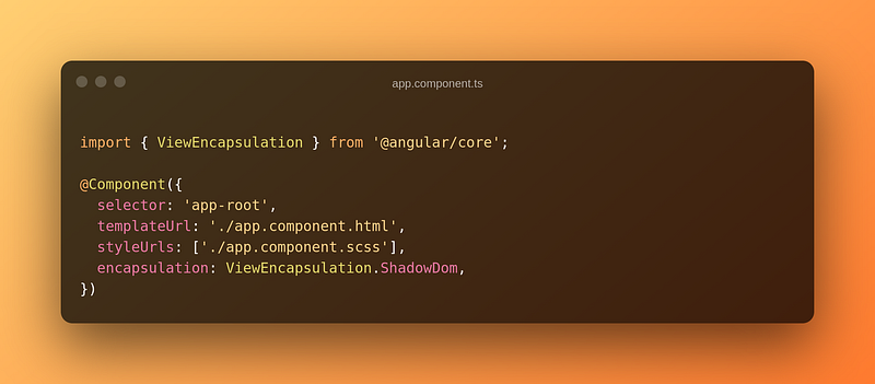
This will ensure that we are rendering using the Shadow DOM. The Shadow DOM is meant for just this situation where we want to have multiple components in the DOM with different styles. The Shadow DOM just ensures that these two things are kept separate. So once we make that change, build the app, and run it again what happens?
Uh-oh! That doesn’t look right at all. What’s happened to make it break like this? Basically, the Shadow DOM doesn’t have any idea about our styling because it isn’t directly in the component’s SCSS file. So let’s change that really quickly.
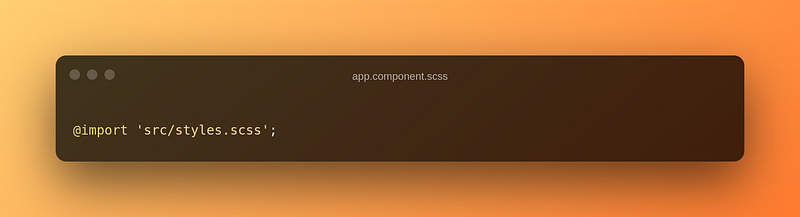
Once we do that and re-build all should look good once again.
Yay, It works! Now we have the main site with its own styling, and our component will keep its styling as well without the component styling bleeding into the main website.
The second point I wanted to make was about testing these. Remember when we turned off outputHashing and why Angular does outputHashing? Well, it turns out the browser is going to cache your elements.js and styles.scss files. This can be a real pain in the ass when you want to test some small changes. I would suggest appending a version number to each release file for production applications. This will ensure that people using your component will not randomly be caught off guard by any changes and will get around the caching issue. It will also help consumers of your components test future releases or roll back if needed. When you’re testing, I would also recommend using incognito to avoid having the browser cache those files all the time. Just remember to close your incognito browsers before retesting.
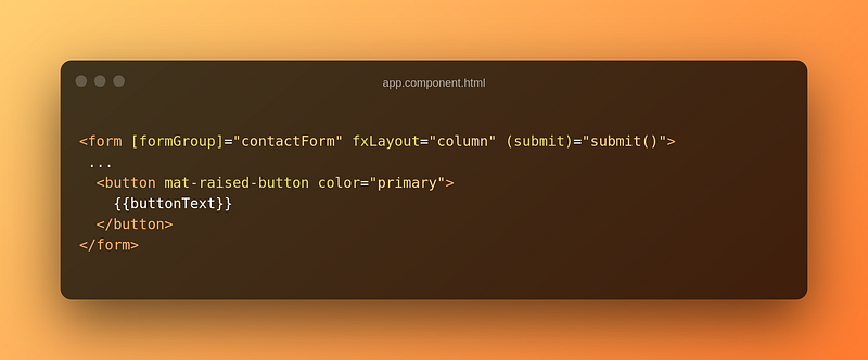
The third and final point was one about sending data into the application. You can 100% do that; I just didn’t have much of a reason to do it in this example. Let’s say, for example, you want to have a custom button name. Just like we output data we can use an @Input to have the consumer of the component enter data into our component.
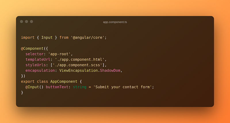
Then we just have to make sure that we’re using that in the HTML template.
Now we can re-build our application and give it a go! I should also note that camel-cased inputs will be turned into kebab-case when you’re actually using the component.
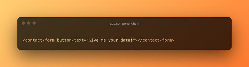
As you can see, it works perfectly! You can find the code for this in the final-notes branch of the GitHub repo (link at the bottom) if you want to poke around it a bit.
Last Words
This has been a quick overview of using Web Components with Angular Elements. I’ve left out a few things, but I’ve tried to explain as much as I could. As you can see, web components can be extremely powerful. You could easily make a lot of executives very happy with the idea that you could actually create a “micro front-end” architecture. There are a few gotchas as you get more and more into it, and there are some limitations. However, being able to export and use the full power of a framework like Angular anywhere on the web can be highly appealing.
If you guys are interested in getting more into Angular Elements and web components, let me know, and I’ll keep making more content like that. If you have any questions feel free to let me know, and I’ll try to get back to you as soon as I can!
If you want to play around with the code, you can find it on GitHub here: https://github.com/shadow1349/angular-elements-demo.
If you’ve enjoyed this article, I’d love for you to join my mailing list, where I send out additional tips, tricks, and newsletters!
If you found this article helpful, interesting, or entertaining, buy me a coffee to help me continue to put out content!